By Way of Illustration: Vasilis Marmatakis
By Daphne Karnezis

By Way of Illustration
Graphic designer Vasilis Marmatakis’s exquisitely subversive poster collaborations with Yorgos Lanthimos
By Daphne Karnezis
February 7, 2024
On a weekday afternoon in downtown Athens’s bustling Kolonaki neighborhood, Désiré café is an oasis of calm, where regulars read the papers and enjoy their coffee to the tunes of soft jazz. The meeting spot is the suggestion of graphic designer Vasilis Marmatakis, best known as the artist behind the awesomely experimental posters for the films of Yorgos Lanthimos, and it’s an apt one: The café was the setting for a scene in Alps, the 2011 film by Lanthimos, whose wholly original thrillers and dark comedies also include the much-feted 2023 Victorian-era romp Poor Things, as well as Dogtooth, The Favourite and The Lobster.
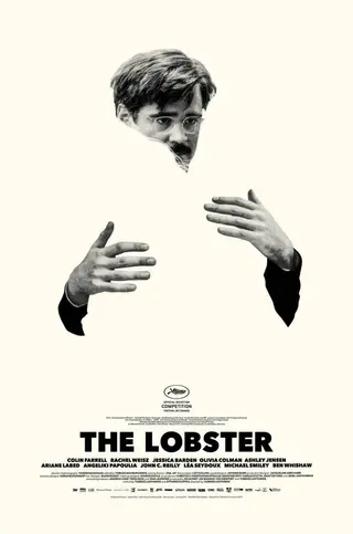
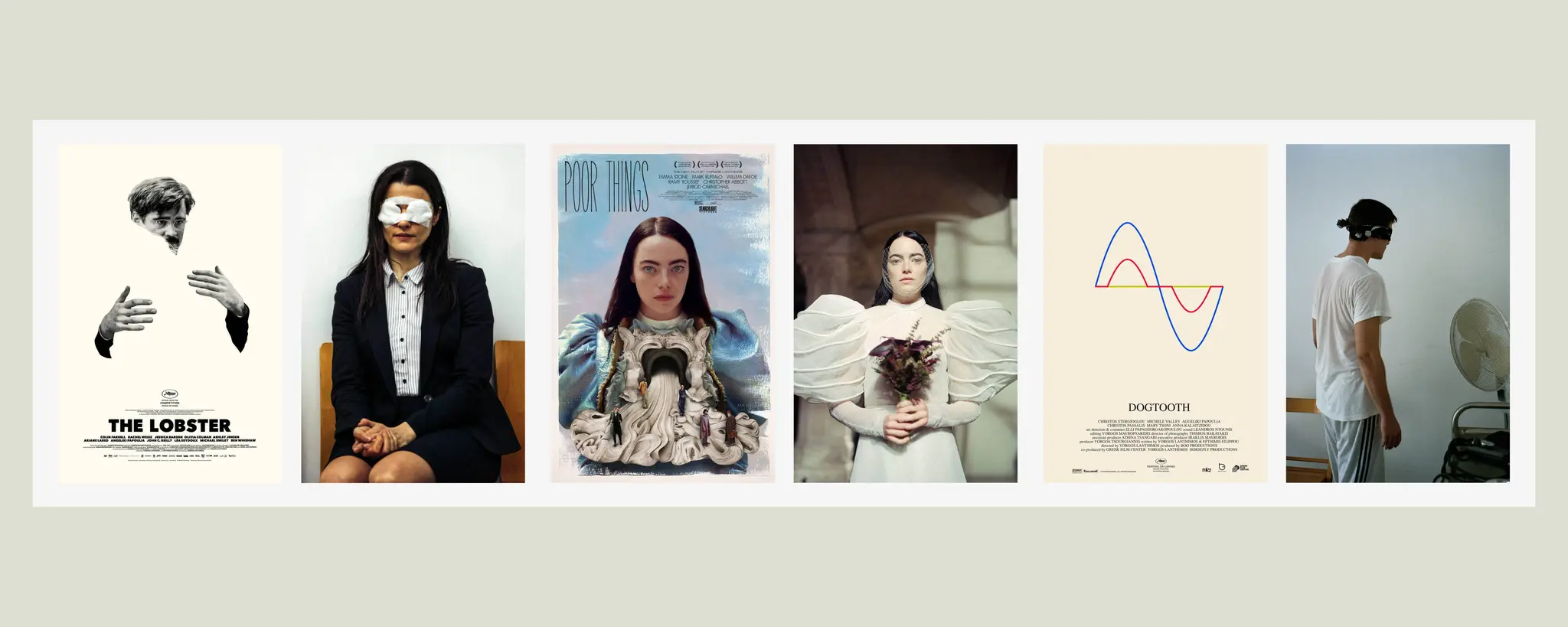
From left: a poster for The Lobster (2015); Rachel Weisz in The Lobster
Since the late 2000s, Marmatakis has created the visual presence for nearly all Lanthimos’s films, with a virtuosity that has distinguished him among his peers. Instantly recognizable from their collage-like elements, distinctive typography and subversive bent, Marmatakis’s masterful, minimalist posters have become celebrated works of art in their own right, fetching hundreds of dollars on memorabilia sites. His works are also part of the permanent collections of the Museum für Gestaltung Zürich, the Academy of Motion Picture Arts and Sciences in Los Angeles and the Staatliche Museen zu Berlin. For Lanthimos’s most recent hit black comedy, Poor Things, already heaped with award nominations, Marmatakis created several striking images: In one version, the protagonist’s insides are spilling out, while the male characters try to balance on her viscera; in another, lead actor Emma Stone’s gaze is fixed and composed, a contrast to the makeup that runs amok across her face.
Over a slice of sokolatina, a Greek chocolate sponge cake, Galerie spoke with Marmatakis—in town from his seaside home outside of the city to teach a class on packaging design at the nearby Vakalo College of Art & Design—about his inspirations, the design process, the power of working by hand and why he never solicits feedback from a client on a work in progress.
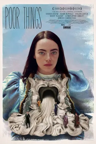
From left: Emma Stone in Poor Things (2023); a poster for Poor Things
A lot has changed in your career over the years, but you’ve decided to stay on teaching the same college course?
Yes. It keeps me connected to what’s happening with younger people, and it’s quite an experimental course. Packaging design is great because it brings together a lot of different elements of graphic design, like illustration, typography and 3D. It’s also a great reason for me to come to the city center, because since lockdown I’ve been based at my summerhouse in Thymari, on the coast near Sounion, with my dogs. I love working there, and it makes sense, too, because most of my clients are based abroad anyway. I have a studio on the ground floor of the house that opens out onto the garden and a beautiful view of the sea. It’s a great spot to be all year round, and there are always friends and family visiting on weekends, though I do visit Athens once or twice a week.
Take us back to the early years. Where did you study?
I always knew I had to move to London because music was my entry point into graphic design and London was a mecca for music in the ’90s. The scene was still edgy and exciting. I was really into artists like Peter Saville, who did the covers for Joy Division; Barney Bubbles, who did postpunk stuff; and Vaughan Oliver, who did the 4AD album art. All these people were from the U.K., so I went off to study graphic design at Camberwell College of Arts in 1996 and then do an M.A. in visual communication at the Royal College of Arts.
What made the biggest impression?
Camberwell was still very experimental, and in the ’90s it was really my favorite place in the world. We were given crazy projects like “Journey to the bottom of the sea, visualize!” Another project was to advertise things like sunbathing and physical birth without reference to the present world. I think that’s the ultimate design brief. And this sense of “impossibility” runs throughout my work. What we really learned there was how to think. As for technique, we did everything by hand. Everything was analog. That process was very important and taught me a lot. When I got my first job, I didn’t know where the “on” button was on a Mac. I had amazing mentors and met so many people I admire at Camberwell and at the RCA, too, like Darren Lago; Michael Anastassiadis; Margaret Calvert [who’s still at the RCA to this day]; Scott King, who was the art director of i-D magazine; and Simon Larbalestier, who did the photography for Pixies album covers.
“These aren’t your classic commercial posters, and Yorgos fought for them. A design is never something that rests solely on the designer. It has to be something the client accepts without changing or altering its essence.”
You mentioned you did everything by hand. Is that still the case?
For me, it’s always been much easier to do something by hand. Computers came into my work much later, when I met Yorgos and Efthimis [Filippou, screenwriter of Dogtooth, Alps, The Lobster and more] while working as a junior art director in advertising. My first job at the agency was to design a logo for a TV station, and I had no computer skills. Nowadays I do both, but there are still a lot of things I like to do by hand. I use pencils, brushes, cutouts. For example, after this interview I have to go and pick up some things I had sent to get laser-cut for the next Lanthimos film. I work with collages a lot. If you look at the album cover I did for Oliver Sim [Hideous Bastard], it was all done with cutouts of letters that I then inserted on the image and photographed. The effect looks digital, but it was all done by hand.
What can you share about your process of working on a film poster?
I usually get a script. I read that and the book, if there is one. I’ll sometimes visit the set a couple of times during filming to get a feel of the atmosphere. I also receive all the photography from filming, something like 5,000 photographs. Then it takes me quite a lot of time to get into it with an idea. Maybe weeks. But once I get going, it really rolls. I tend to create a few different versions because you can’t tell the whole story of a film with just one poster. Each version covers different bases. Designing the presentation set takes two months, minimum. I might try out 30 different ideas and only two will work—or none! I do the typography design myself too, because I think it’s an essential element, like salt or olive oil for food. Typography is something you can’t really learn anywhere else other than on the job. Once in a while I might show a few trusted friends something to get some feedback. But I’ll never show the film studio or any client anything that’s a work in progress. I don’t think any of the posters can convey what I intend unless they’re totally done.
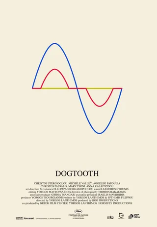
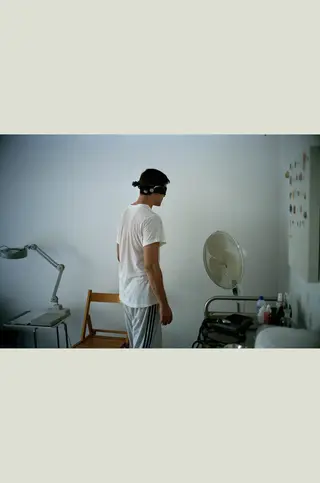
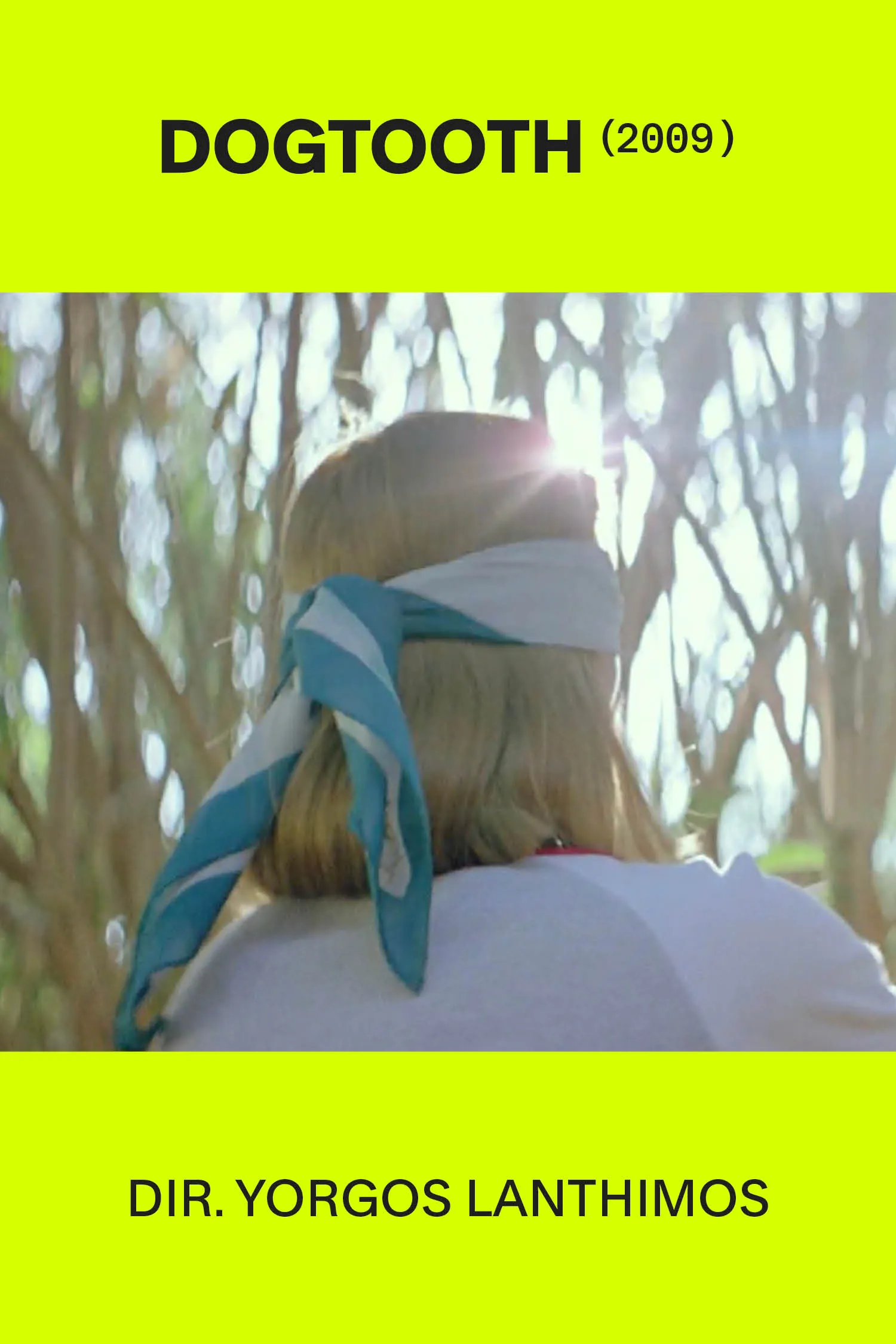
From left: a poster for Dogtooth (2009); Christos Passalis in Dogtooth
So what happens when it’s time to pitch your work?
Whenever I have a presentation, I’ll print off all the posters on different kinds of paper. That’s what I did recently with Searchlight [Pictures], the distributor of Poor Things. The funny thing was, there wasn’t any free wall space at their offices, so I just had to lay them all out on the floor and we sort of walked around them, talking. I gave them some options and then there was a lot of back-and-forth. The one where Emma Stone’s makeup looks smudged was the initial poster, then there was the one with two sets of hands, and the third one was the one that looks like guts are spilling out of her costume. There were a lot of negotiations because these aren’t your classic commercial posters, and Yorgos fought for them. A design is never something that rests solely on the designer. It has to be something the client accepts without changing or altering its essence.
Do you have any go-to resources when it comes to graphic design?
For me, my inspiration isn’t design directly but more my hobbies and interests—like film, music, concerts, even the news. I’m definitely affected by what’s happening and the world going up in flames. I can’t help but sometimes think that what I do is futile or unimportant.
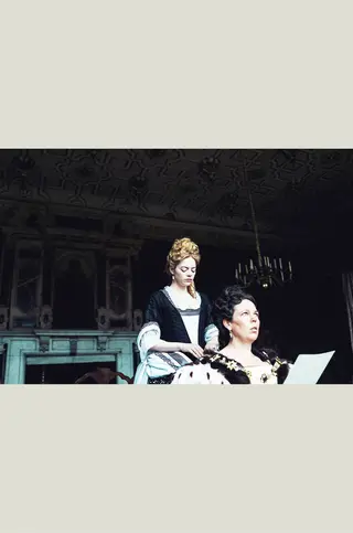
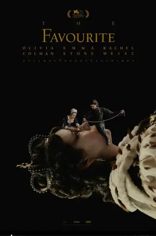
From left: Emma Stone and Olivia Colman in The Favourite (2018); a poster for The Favourite
What design books are on your coffee table?
I don’t have any design books on my coffee table, but I did recently buy a great book with stills from the films of German director Rainer Werner Fassbinder and another with the collection of all the hand-drawn record covers of Sun Ra.
Any projects you’re working on at the moment beyond film?
Yes, I’m trying to do other things too. I’m excited about designing the corporate identity of an architecture practice at the moment. I’m also doing the cover for a book about sound theorists. I definitely learned a lot by working for more corporate clients in the past, like banks and telecoms, and it’s great being able to apply this knowledge to more experimental projects.