Branding Cannes
By Kaleem Aftab
branding cannes
Kaleem Aftab
Designing the official poster for the world’s most prestigious film festival
Poster images courtesy of Hartland Villa
May 16, 2025
Each year, the Cannes Film Festival unveils a poster that sets the tone for the annual event, honoring cinematic history while offering a potent visual statement about the present—where design becomes narrative. For the past five years, the responsibility of creating that image has fallen to Paris- and Brussels-based creative studio Hartland Villa, led by Lionel Avignon and Stefan de Vivies. Known for their emotive and intuitive approach, they treat poster-making more like remixing or painting than traditional design. With no brief to start from, the duo dig through cinema’s past, rethink iconic images, and respond instinctively to current events and cultural mood. From using a still from Peter Weir’s The Truman Show during the early days of the war in Ukraine to this year’s dual homage to the late Anouk Aimée and Jean-Louis Trintignant, Hartland Villa’s work walks a fine line between elegance, symbolism and visual surprise. We spoke with them about the stories behind these posters and the highly collaborative, often unpredictable process of working with the festival Wim Wenders described as “the Mecca of cinema.”
Cannes 78th Edition poster inspired by A Man and a Woman (1966)
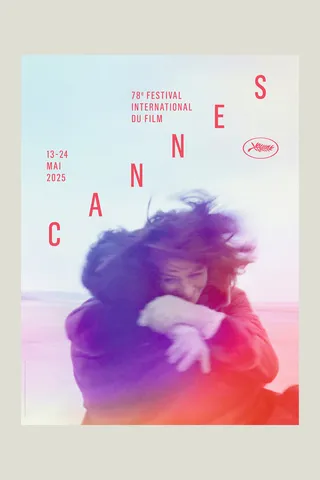
A Man and a Woman (Un homme et une femme), dir. Claude Lelouch, 1966
Your agency, Hartland Villa, has created the Cannes posters for the past five years. What kind of brief do you receive from the Cannes Film Festival each year?
Lionel Avignon: There is nothing predetermined, and they know that it's a long process. It involves digging through many pictures. They have no brief at the beginning. They really have no idea of what they want each year.
So how do you go about choosing the image if there is no clear direction?
LA: There is someone at Cannes [Caroline Vautrot, Head of Print Communication] who looks at things like whether there is a famous actor they want to celebrate, or if there is someone or a film that won a prize 10, 20 or 50 years ago. She goes in many different directions, thinking we should try this and that. We say yes, we say no. We also go through our own process of finding pictures. It’s a job that starts in December, and we know we are going to show them many different versions.
Does it always have to be an image from a film?
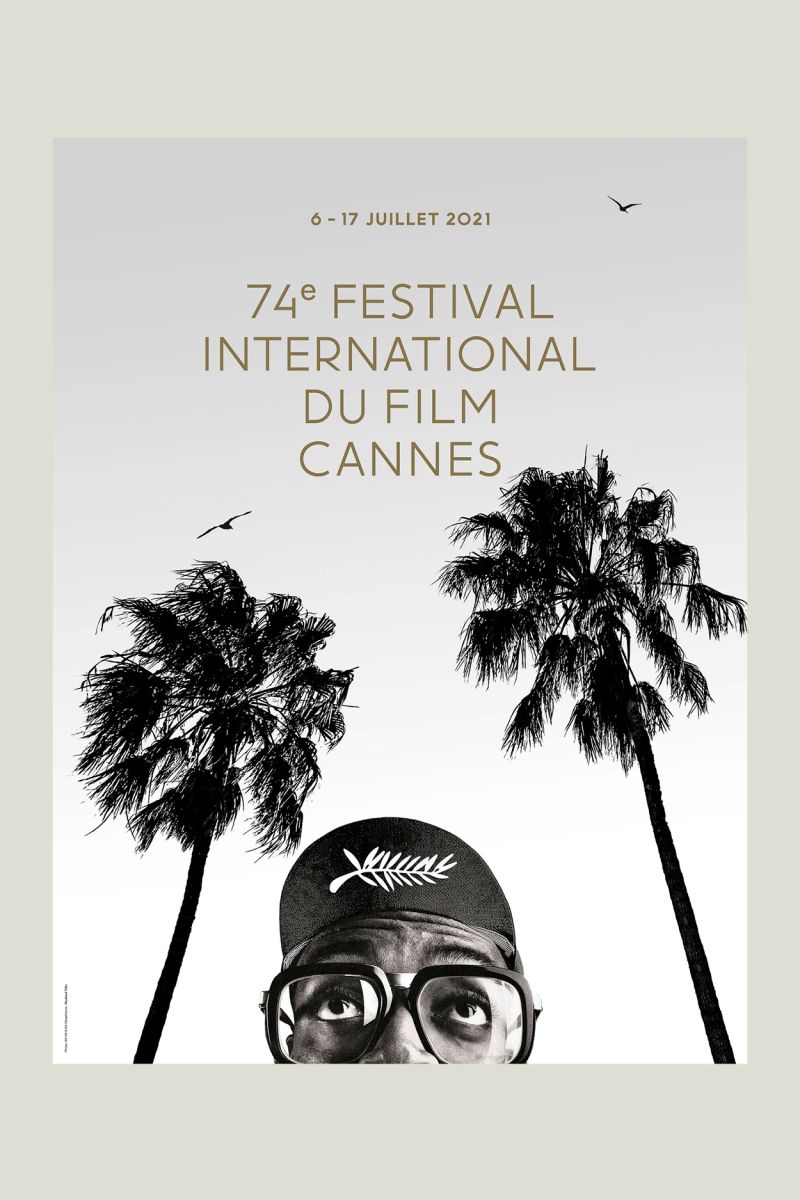
LA: That’s part of the idea, to have a still from a movie. But having said that, the first year we worked on a poster, it was not an image from a movie but a photo supplied to us of Spike Lee, who was the President of the Jury that year.
Can you give us an example of how a particular year’s events influenced the process?
LA: This year, for example, David Lynch died in January. We spent the whole month of January thinking of an homage. Some people in Cannes were very for it and some were not so sure, for their own reasons. We cannot comment on that. Our job is to propose many different directions and ideas. But as I say, each time we start with a blank page, with no idea where we’ll end up.
“We try to find the right balance—between being elegant and being political, between showing off and sending a message.”
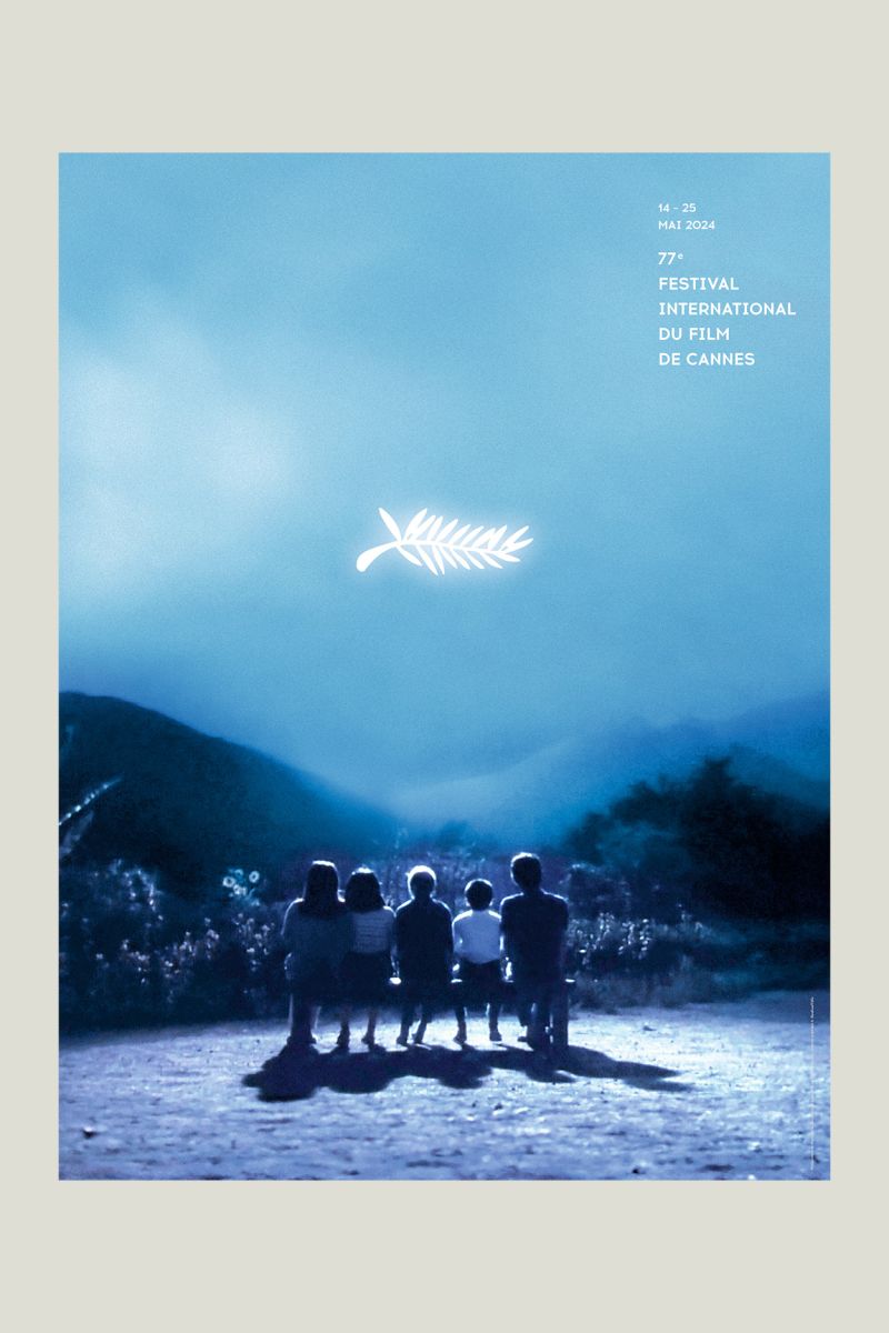
Cannes 77th Edition poster inspired by Rhapsody in August (1991)
How would you describe the overall process of making the poster?
LA: It’s a marathon. After four or five years, we know that while we always hope to have something ready in February or March, at that time the people in Cannes are concentrated on many different things. The final decision always comes quite late. It’s kind of empirical like that—not very rational. It’s very emotional to work with them, and I think that’s what they like about us
What do you mean when you say you’re “remixing” an image?
LA: In fact, all our work is like a DJ remixing stuff—picking a picture and thinking, Oh, this old film, this scene, is still very contemporary. It can be political, ethical, a message of freedom that the festival wants to give. It can relate to many different feelings. We pick the picture and start working on it, painting or rearranging stuff in our own way.
So how did that bear out with this year’s poster, featuring the beach embrace between Anouk Aimée and Jean-Louis Trintignant from Claude Lelouch’s 1966 film A Man and a Woman (Un homme et une femme), which won the Palme d’Or at the 19th Cannes Film Festival?
LA: That was our idea. The scene in the film is about turning around—a man, a woman. It’s about love, about the connection between men and women, and the idea of equality. We wanted to show that in the poster. These two wonderful actors had both received prizes and both died—Anouk last year, Jean-Louis a few years ago. They both had international careers. We felt this picture and this idea of connection between a man and a woman was important. Behind it is also all the political and social questions about men and women today—after #MeToo, in cinema. We wanted to bring something a little political but not too pushy—because it’s the Festival de Cannes and they don’t want to be too political. But we had to send a message of love, of people embracing each other, to bring peace in a world that’s lacking these touching emotions.
It’s also the first time that Cannes has a double poster, the embrace from two different perspectives. Can you explain how that came about visually?
Stefan de Vivies: At the beginning, we had these celluloid-style strips of that famous scene where they’re turning around on the beach with the music. We tried different compositions, different positions, working around that idea of cinema and movement. In the end we chose one image because it was stronger. But we still wanted that feeling of movement, of man and woman together. So we selected two images from the film and said, okay, for once let’s have two images for the festival. And then came the idea to print the posters reversed—each side with a different image, so you can turn it. It matched the cinematic feel of that particular scene.
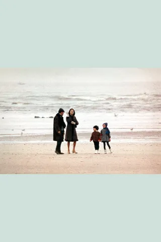
Cannes 76th Edition poster inspired by Heartbeat (1968)
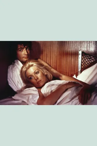
Heartbeat (La chamade), dir. Alain Cavalier, 1968
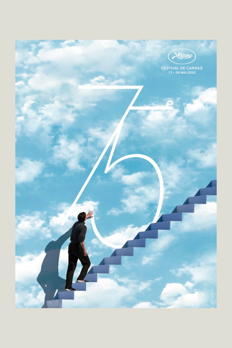
One of the more surprising choices in recent years was using The Truman Show. That film wasn’t even in Cannes. How did it end up as the poster?
SdV: As I said earlier, it’s a complicated process and really based on feelings. That picture came up after a long time of choosing and looking for images. We found these pictures of The Truman Show at the beginning of the process and it stayed with us. And we liked it because at that time, it was matching a need to acknowledge the beginning of the Ukrainian war. I think it was around the beginning of the Ukrainian war.
LA: Yes, it was definitely connected to the Ukrainian conflict. When we were designing that poster, [festival director] Thierry Frémaux wanted a message of freedom—of opening something toward freedom but without being too obvious. So the idea of The Truman Show was exactly that—a message of freedom. [The image depicts Jim Carrey, who plays Truman, iascending the stairs to break out of the reality-television world he has been living in.]
Once you’ve chosen an image and talked about remixing it, what are the required elements you have to include in a Cannes poster—typeface, the festival name, edition number and so on?
SdV: We don’t really have any obligations. It depends on how the image comes together, what it needs. For example, this year we didn’t work with the word Cannes in most of our concepts, or very little. But in the final composition, Cannes ended up being a nice signature for the image, so we included it.
Last year it was great to use the Palme d’Or logo as a moon, like a light from a projector or a symbol of cinema, which we used in an image from Kurosawa’s 1991 film Rhapsody in August. Of course we always have to include the dates and “Festival International du Film,” but it’s not mandatory how big or where. For example, The Truman Show poster had a huge “75”—a big typographic signature. This year was the 78th [edition of Cannes], and we tried different typography compositions and options, but in the end we went in another direction because it didn’t really fit.
What about color choices? Is that something you’re free to explore each year?
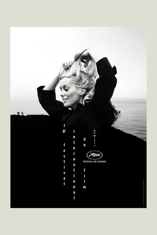
LA: Again, it’s really about emotion and feeling. We are very free. Some years it’s black and white, sometimes it’s in color. For example, the year with Catherine Deneuve and the year with Spike Lee were both black and white, so for the following year we wanted something in color—not because Cannes asked, but because we felt that was right. The Truman Show poster was very blue, so the year after, we wanted to avoid something too blue again.
This year the original scenes from Un homme et une femme were very dark and gray—it was filmed in February. So we wanted to bring a strong color intervention to it—our own touch—to make it more pop, cooler, more joyful than the original.
We allow ourselves to stretch the frame, recolor the image, and make a kind of artistic intervention, like painters. With the Kurosawa film last year, we extended the image very widely. And for the Catherine Deneuve image from Heartbeat (La chamade, 1968), for the 76th edition’s poster, we kept her but completely changed the background—replacing it with the sea, merging it with a mountain or volcano. It looks original, but it’s actually a collage. It’s all about creating something visually striking while staying true to the feeling we want to express.
“All our work is like a DJ remixing stuff—picking a picture and thinking, Oh, this old film is still very contemporary.”
Cannes 75th Edition poster inspired by The Truman Show (1998)
What’s the day of the poster unveiling like for you? Are you nervous about the reaction?
SdV: Well, the Pope died on that day this year! But yes, it’s a long process. And it can be tough. We make lots of different propositions and directions. Even at the end, we might have three options we like. When it’s finally chosen, and presented, we feel a huge relief honestly. I think it’s the same for the festival team. When the poster finally comes out, everyone can breathe a bit.
What’s it like to have your work unveiled in such a high-profile way?
LA: It’s amazing, because there aren’t many posters in graphic design that are so anticipated, so widely seen. For us, it’s great to be part of that, to have our work revealed on such a big stage. The good thing is, people are usually pleased. There’s always a story, a good reason behind the poster—even if part of it is very internal to the festival team. Once it’s revealed, the poster doesn’t belong to us anymore—it becomes something that belongs to everyone.
Do the posters together tell a story about the festival and cinema over time?
LA: I think each year is different. For many of our other clients, we follow a line, a set of rules, some kind of visual consistency. But for Cannes, each poster is an individual. We try to find the right balance—between being elegant and being political, between showing off and sending a message. But no, we don’t follow any strict rules. Each poster stands on its own.
Still, looking at the last five or even 20 years, there seems to be a consistent celebration of cinema—almost a philosophy behind the choices.
SdV: Yes, that’s true. Even beyond our posters, if you look at the whole series—ours and others before—there’s definitely a direction. It’s about celebrating cinema with a big C. Something beautiful, universal, timeless. And when we do our research throughout the year, we’re thinking about that too. For example, last year we wanted to highlight Asian cinema. Cannes also told us Kurosawa would be honored, so that helped guide the direction. In the end, it’s all about celebrating cinema.
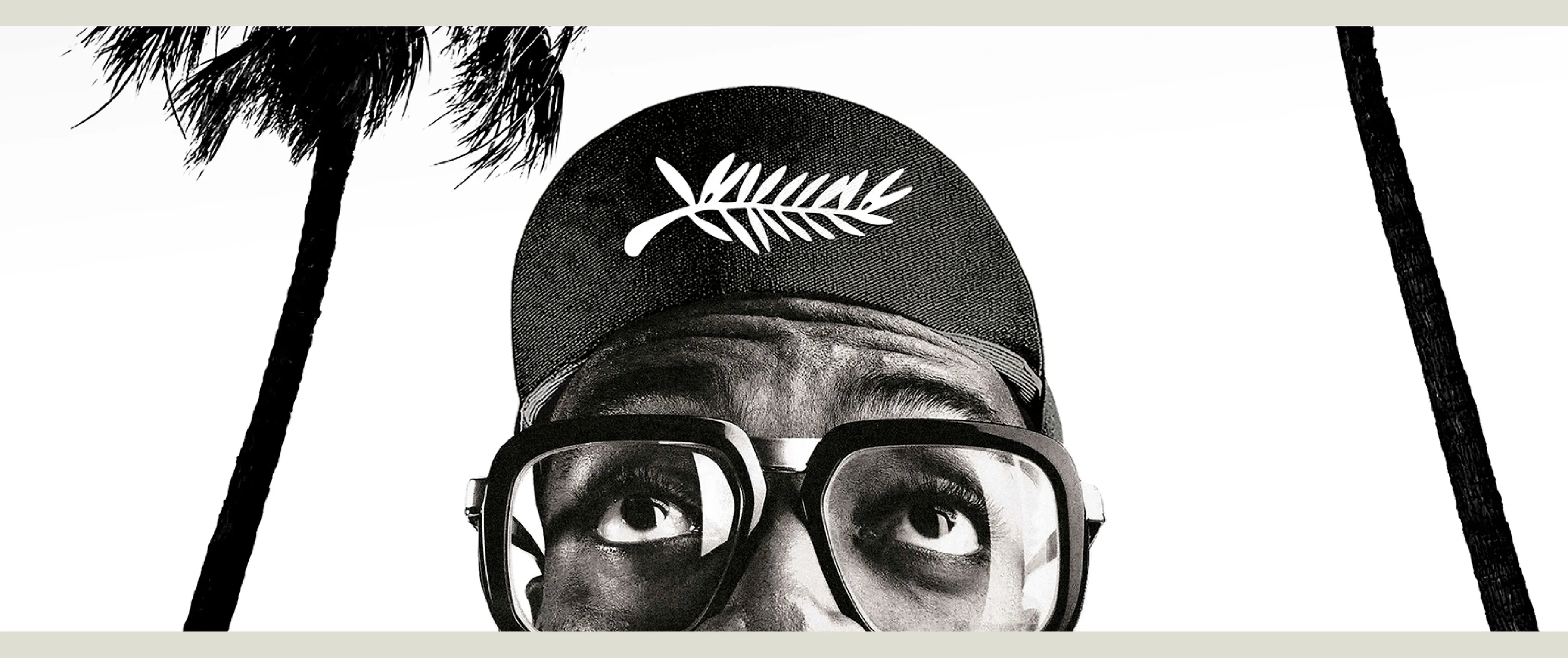
Cannes 74th Edition poster featuring jury president Spike Lee